VISION

Sounding Board’s leadership envisioned a brand new product that would allow mentees to find mentors within their own company, either through mentee-guided matching or admin-guided matching.

As mentoring was a brand new product being developed on a tight schedule, the primary goal was to produce an MVP for existing clients interested in purchasing mentoring on top of other Sounding Board products.

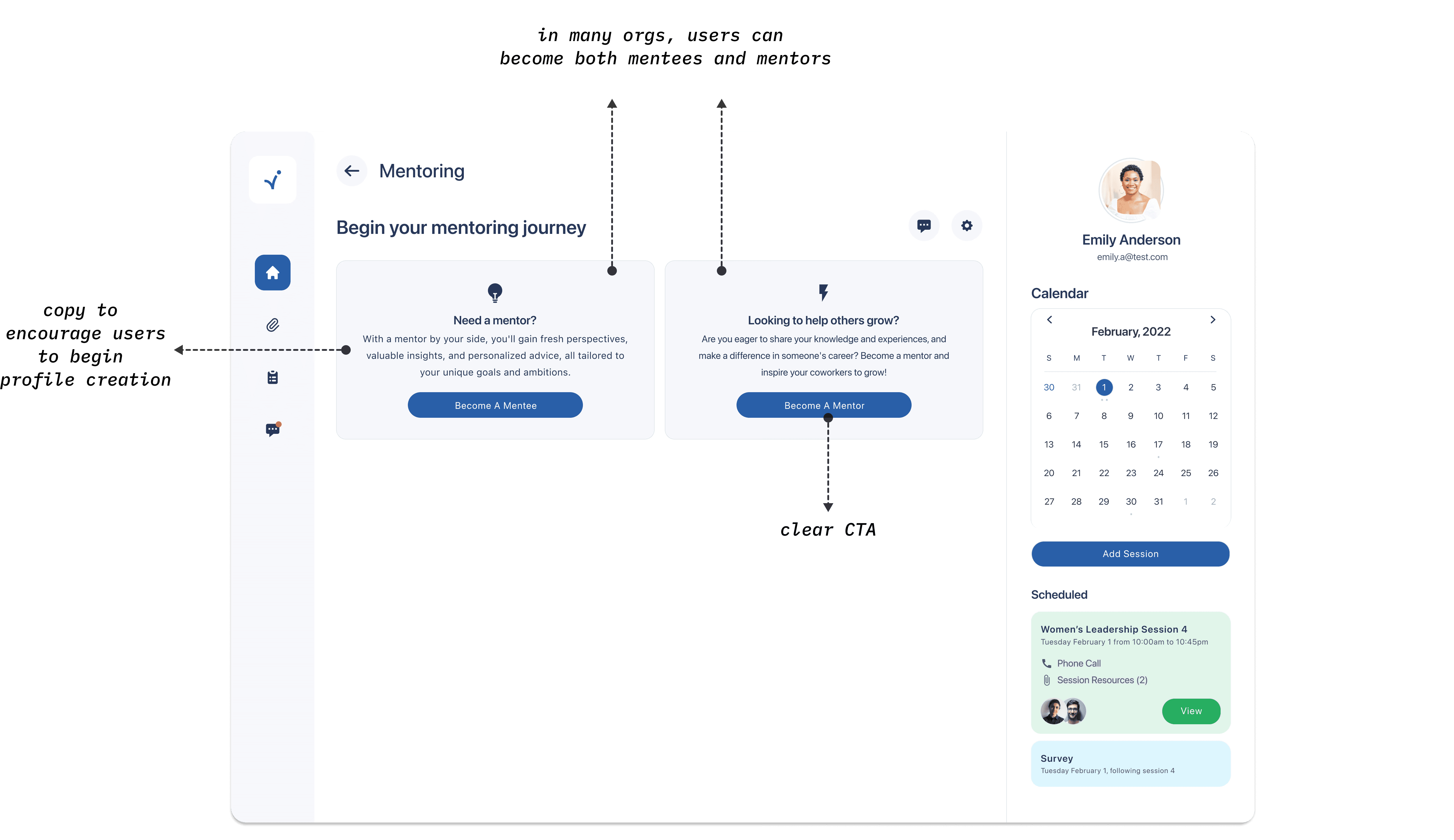
Though I worked broadly across the product, this case study focuses on the profile creation process for new mentors and mentees.

INTRO

Sounding Board offers several leadership development services that can be used in tandem. All users go through the same initial onboarding and account creation processes. They provide data on their role, YOE, personality, communication style, thinking style, and more. This data is used to make good matches for both coaching and mentoring users. 

One of the early challenges was collecting the additional data needed for mentoring users without overwhelming them during the onboarding process. This would enable us to create mentor and mentee profile cards and make good matches between mentors and mentees.

One of the early challenges was collecting the additional data needed for mentoring users without overwhelming them during the onboarding process. This would enable us to create mentor and mentee profile cards and make good matches between mentors and mentees.

One of the early challenges was collecting the additional data needed for mentoring users without overwhelming them during the onboarding process. This would enable us to create mentor and mentee profile cards and make good matches between mentors and mentees.

RESEARCH

To inform our early understanding of the problem space, we:

  1. spoke to customer-facing stakeholders from the Sales and CX teams to glean needs

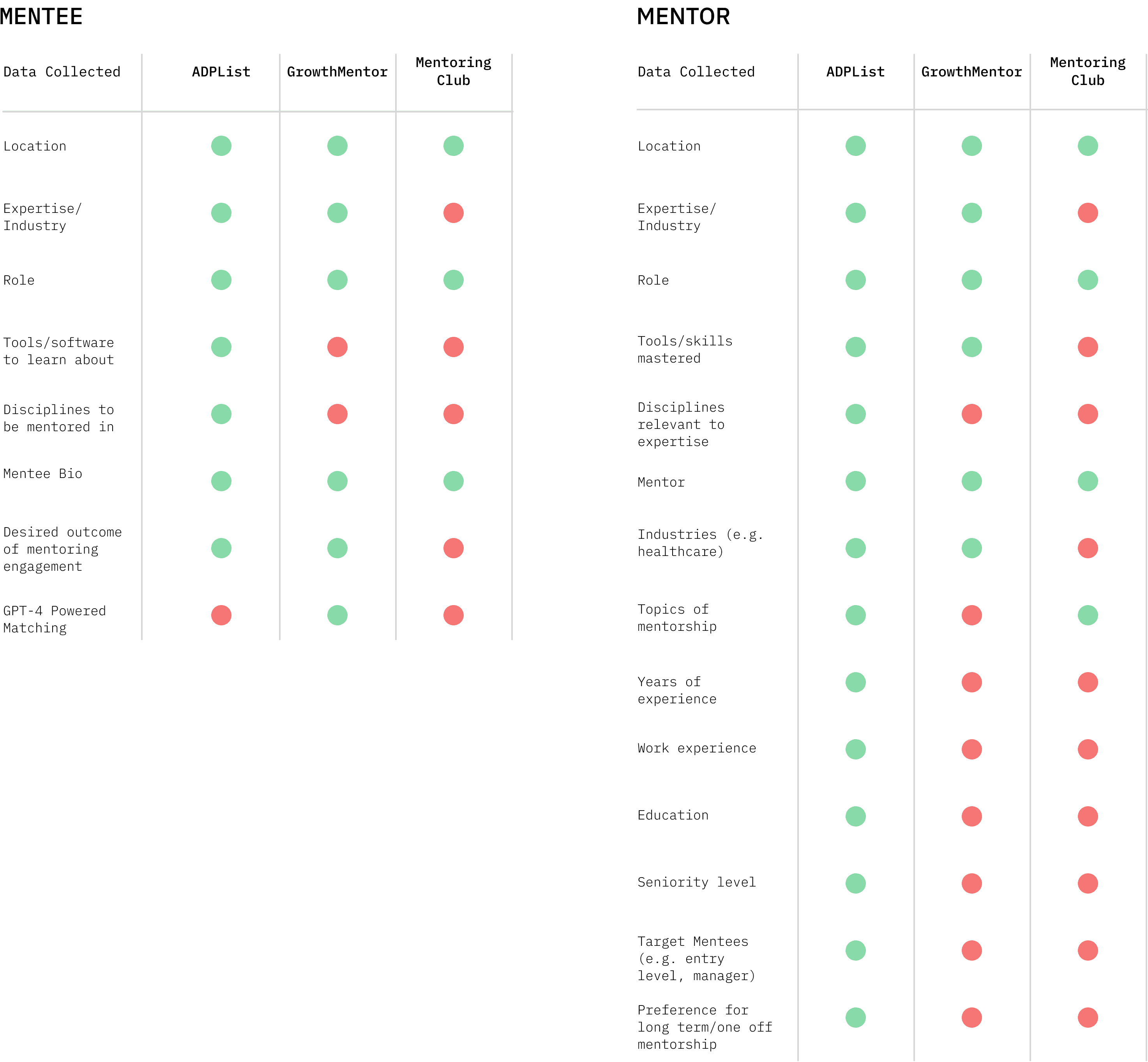
  2. conducted a competitive audit on mentor-mentee matching

  3. determined what data to collect during profile creation to make good matches

Given time and resource constraints, we were unable to conduct as much generative research as we would've like to.

The chart below displays the results of our competitive audit, which looked at the kinds of data competitors were collecting to make matches between mentors and mentees.

IDEATION & USER FLOW

Our goal was to make the mentor/mentee profile-creation process efficient and simple, placing low cognitive load on the user.

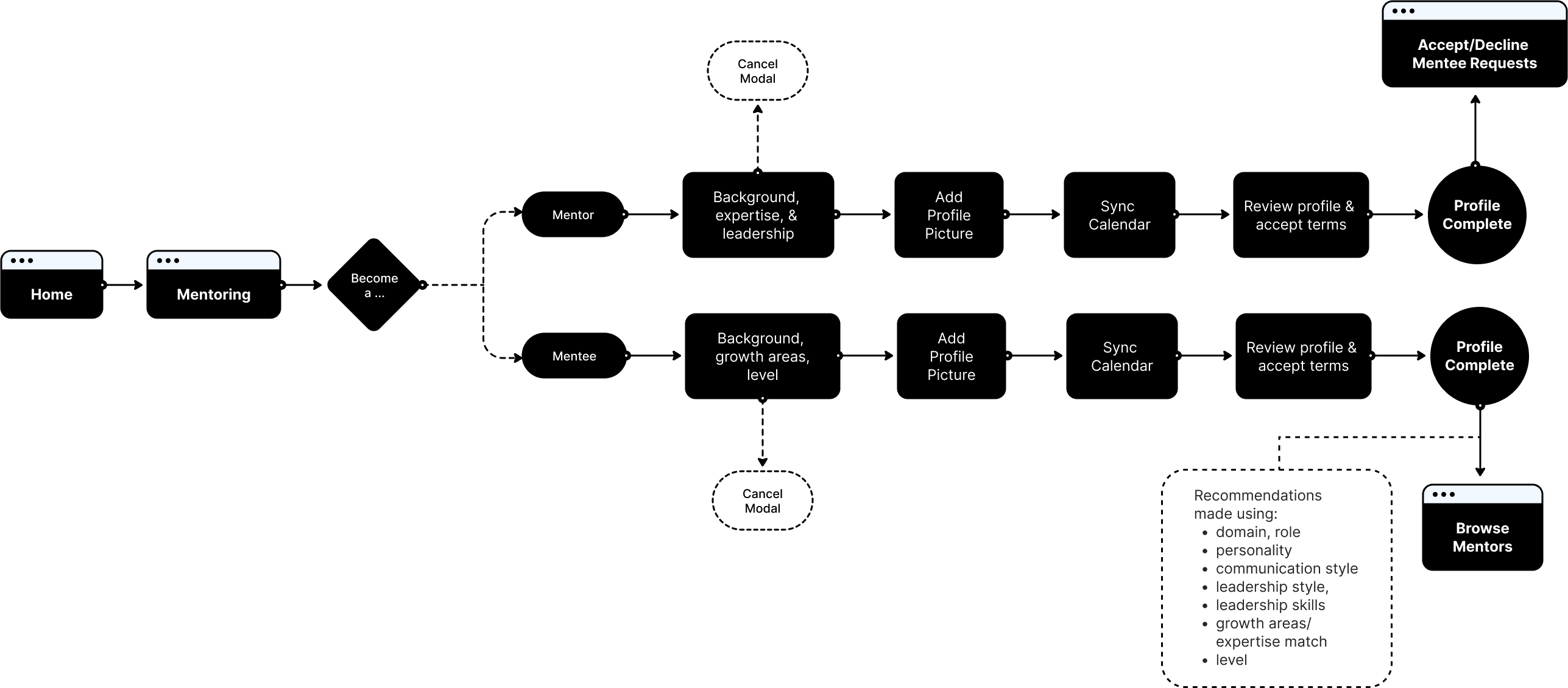
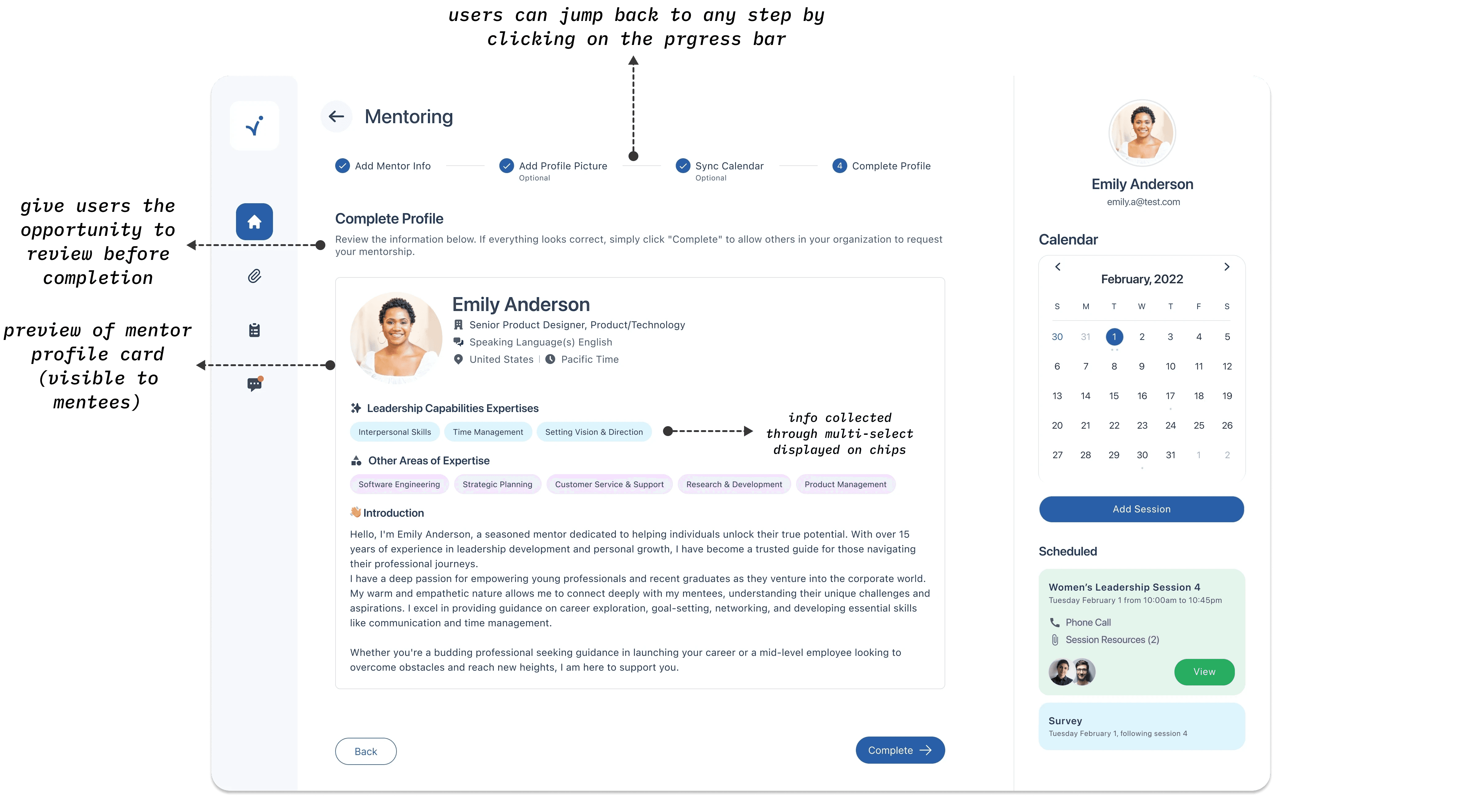
Based on our research, we decided to create a wizard with the following steps:

ITERATION

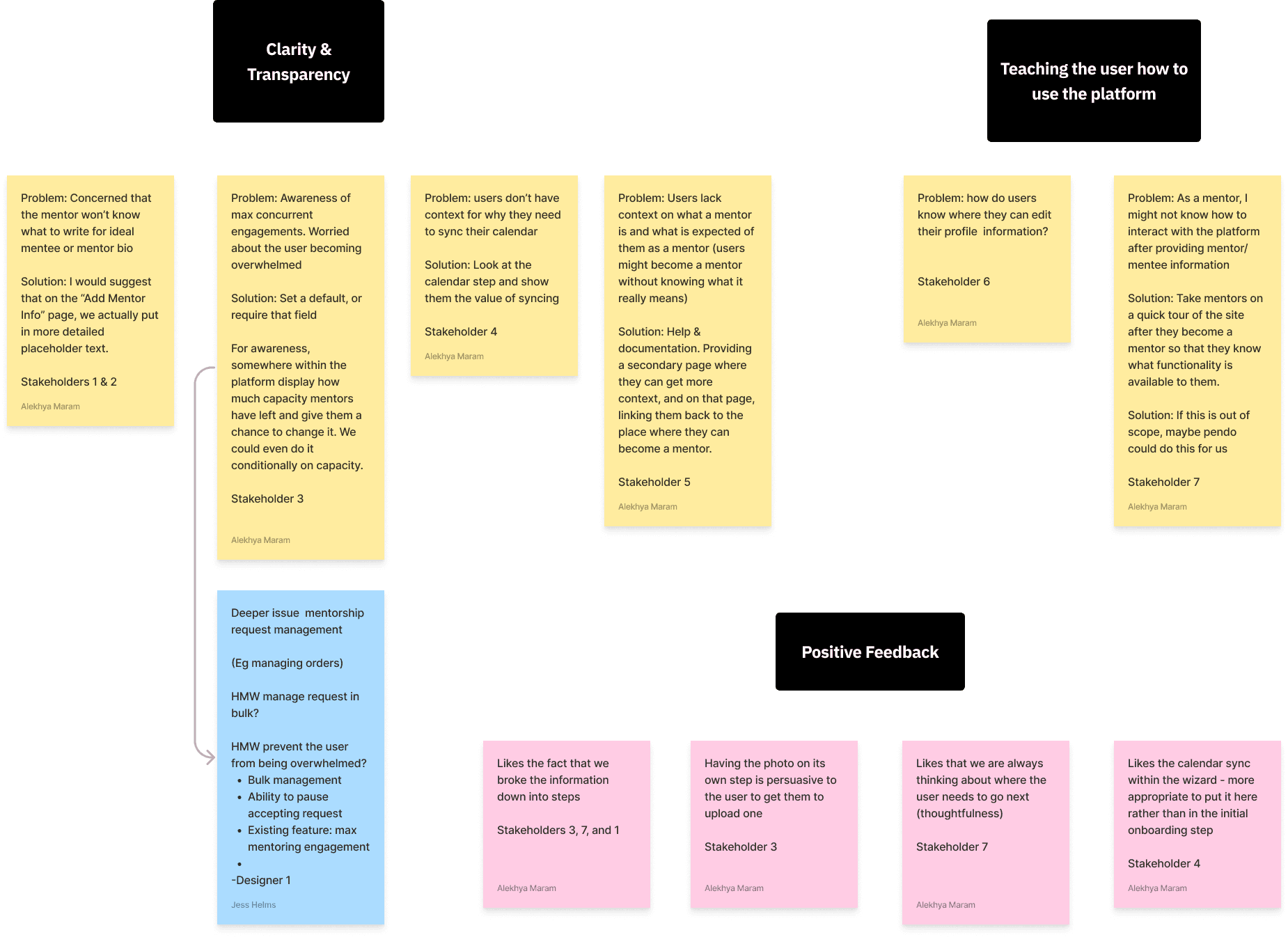
We presented early designs to stakeholders from several teams (sales, coaching excellence, executive leadership team, customer experience, engineering, etc.) and compiled their feedback.

Sales also demonstrated the product to clients, and provided us with user feedback.

Based on this feedback, we iterated on our designs with a detail-oriented approach. We focused on micro-interactions and UX copy.

Design decisions included:

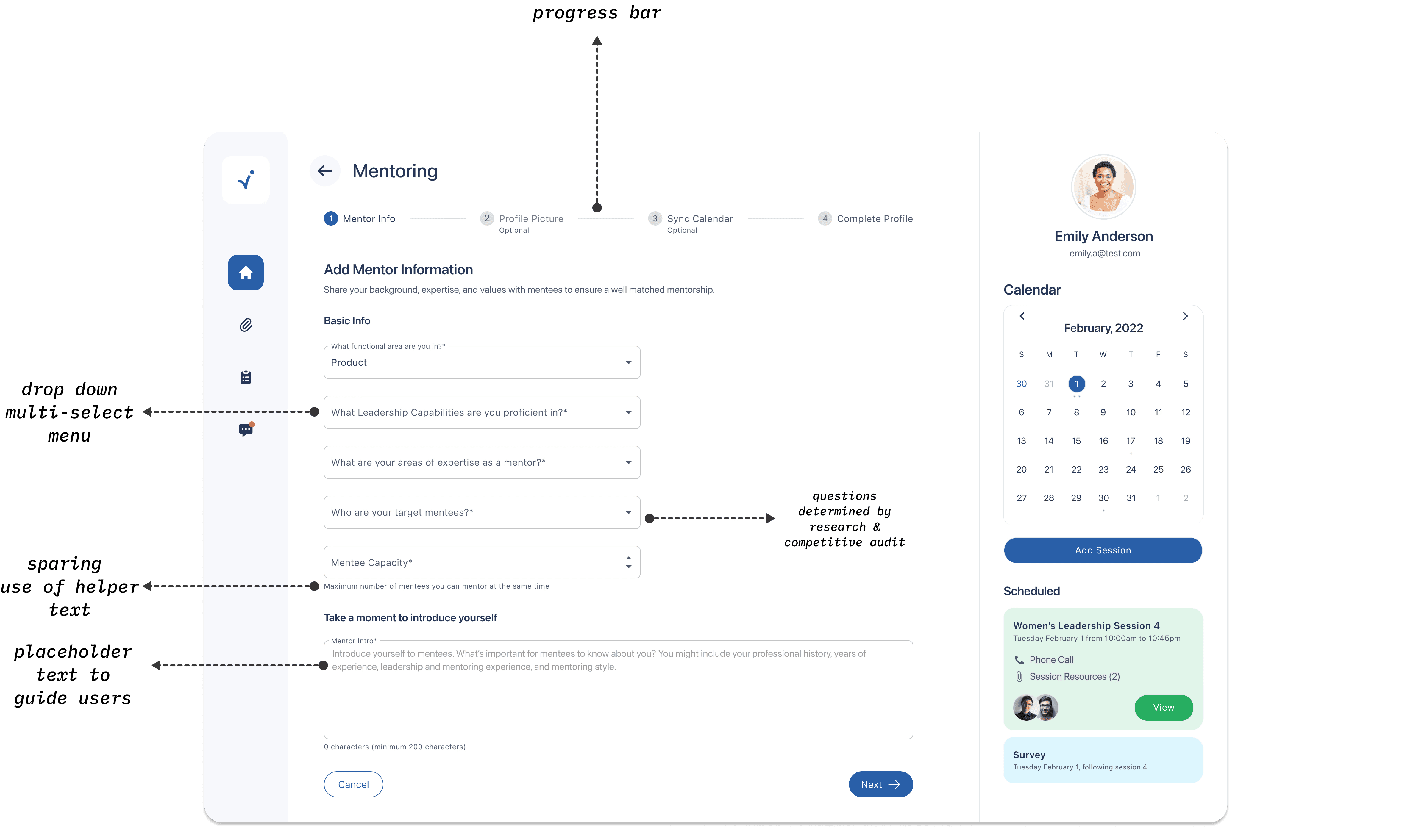
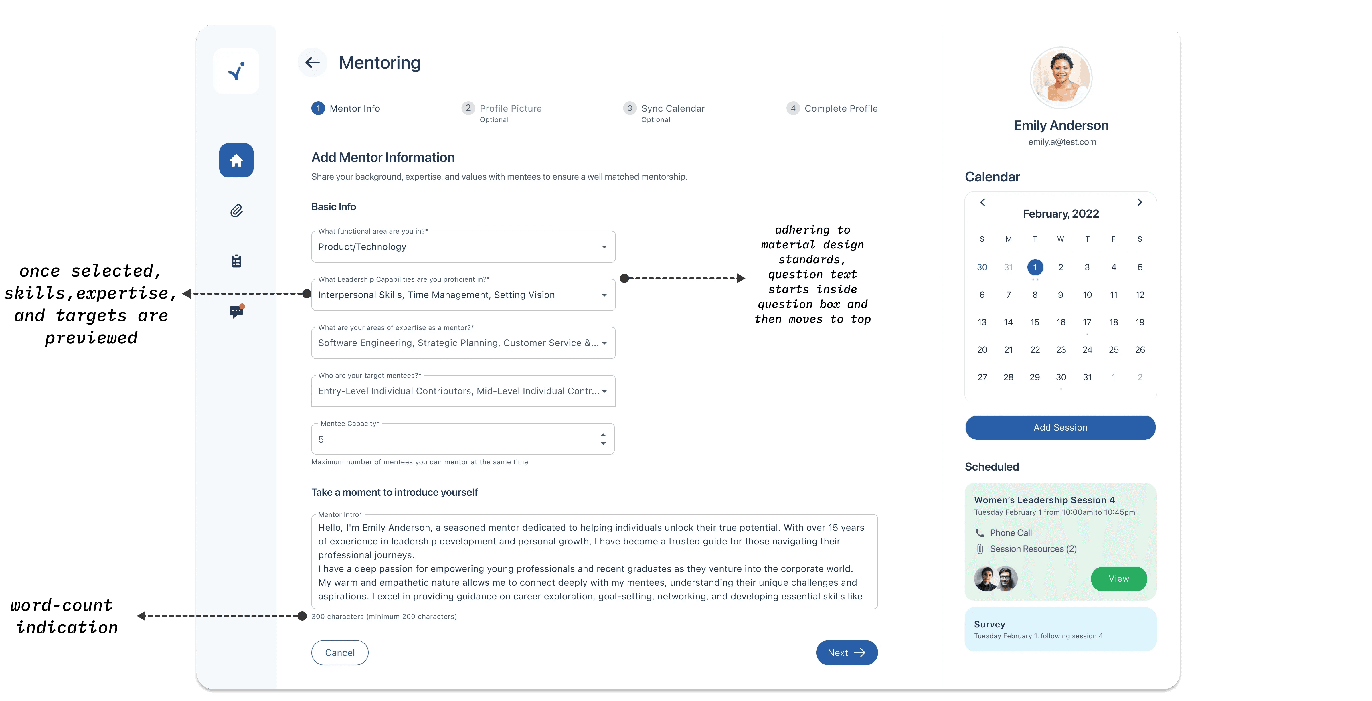
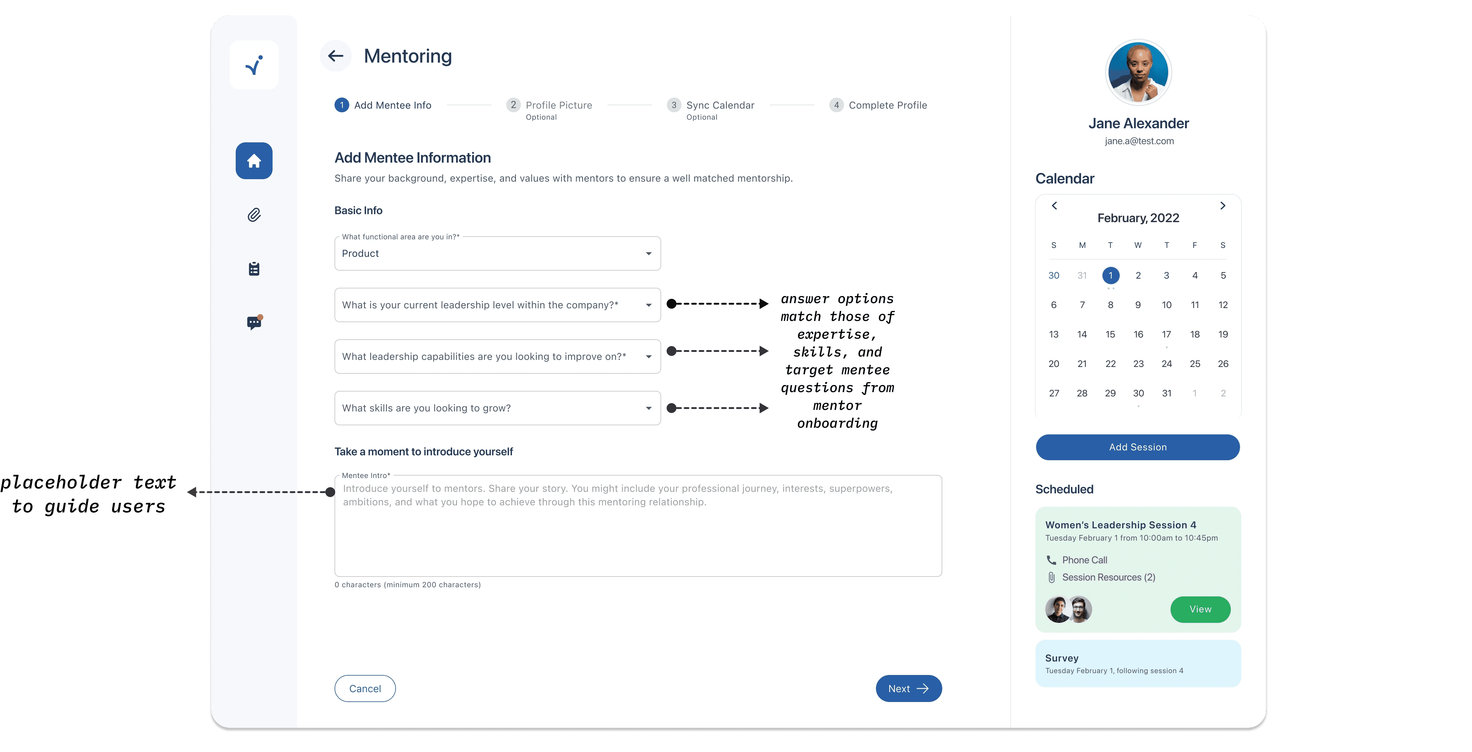
  • the best medium to collect user data for each question (e.g. multi-select/chips, open textbox, etc.)

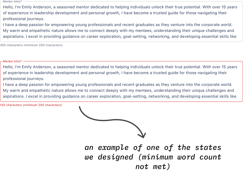
  • creating different states for different scenarios (e.g. the user is over/under the word count, a required field is left empty, etc.)

  • phrasing our questions and prompts intuitively and efficiently


We iterated on our designs with a detail-oriented approach. We focused on micro-interactions and UX copy. Design decisions included:

  • the best medium to collect user data for each question (e.g. multi-select/chips, open textbox, etc.)

  • creating different states for different scenarios (e.g. the user is over/under the word count, a required field is left empty, etc.)

  • phrasing our questions and prompts intuitively and efficiently

FINAL DESIGNS

MENTOR PROFILE CREATION

MENTEE PROFILE CREATION

Made With ❤️ & 🍵 in Canva, Figma, and Framer!

Made With ❤️ & 🍵 in Canva, Figma, and Framer!

Made With ❤️ & 🍵 in Canva, Figma, and Framer!